Web制作の現場でよく使ってきたCSSのみで実装するボタンデザインを紹介します。hover時のスタイルも合わせて公開しているので、そのまま利用することができます。主に自分用のデザインストックとして投稿しますが皆さんも使えるボタンデザインがあるかもしれません。ぜひあなたの現場でもご活用ください。
背景色と矢印のボタン
<div class="button01">
  <a href="">ボタンデザイン</a>
</div>
.button01 a {
  display: flex;
  justify-content: space-between;
  align-items: center;
  margin: 0 auto;
  padding: 1em 2em;
  width: 300px;
  color: #333;
  font-size: 18px;
  font-weight: 700;
  background-color: #cccccc;
  transition: 0.3s;
}

.button01 a::after {
  content: '';
  width: 5px;
  height: 5px;
  border-top: 3px solid #333333;
  border-right: 3px solid #333333;
  transform: rotate(45deg);
}

.button01 a:hover {
  text-decoration: none;
  background-color: #bbbbbb;
}
シンプルな矢印と背景色の組み合わせのボタンです。
justify-content: space-betweenとalign-items: centerの組み合わせで、左右両端と上下中央に配置しています。
矢印をposition: absoluteで配置する方法もありますが、flexboxでの組み合わせの方がコードが少なくなるのでこちらを採用することが多いです。
背景色と矢印、角丸のボタン
<div class="button02">
  <a href="">ボタンデザイン</a>
</div>
.button02 a {
  display: flex;
  justify-content: space-between;
  align-items: center;
  margin: 0 auto;
  padding: 1em 2em;
  width: 300px;
  color: #333;
  font-size: 18px;
  font-weight: 700;
  background-color: #cccccc;
  border-radius: 50vh;
}

.button02 a::after {
  content: '';
  width: 5px;
  height: 5px;
  border-top: 3px solid #333333;
  border-right: 3px solid #333333;
  transform: rotate(45deg);
}

.button02 a:hover {
  text-decoration: none;
  background-color: #bbbbbb;
}
角丸にしたシンプルなボタンです。丸みがあるので優しい印象のサイトに採用しています。
枠線と矢印のボタン
<div class="button03">
  <a href="">ボタンデザイン</a>
</div>
.button03 a {
  display: flex;
  justify-content: space-between;
  align-items: center;
  margin: 0 auto;
  padding: 1em 2em;
  width: 300px;
  color: #2285b1;
  font-size: 18px;
  font-weight: 700;
  border: 2px solid #2285b1;
}

.button03 a::after {
  content: '';
  width: 5px;
  height: 5px;
  border-top: 3px solid #2285b1;
  border-right: 3px solid #2285b1;
  transform: rotate(45deg);
}

.button03 a:hover {
  color: #333333;
  text-decoration: none;
  background-color: #a0c4d3;
}

.button03 a:hover::after {
  border-top: 3px solid #333333;
  border-right: 3px solid #333333;
}
テーマカラーをボタンに採用したいけどボタンの数が多い時に採用するデザイン。テーマカラーの印象をほどよくつけたい時に使っています。
淡い枠線と矢印のボタン
<div class="button04">
  <a href="">ボタンデザイン</a>
</div>
.button04 a {
  display: flex;
  justify-content: space-between;
  align-items: center;
  margin: 0 auto;
  padding: 1em 2em;
  width: 300px;
  color: #2285b1;
  font-size: 18px;
  font-weight: 700;
  border: 3px solid #a0c4d3;
  border-radius: 10px;
}

.button04 a::after {
  content: '';
  width: 5px;
  height: 5px;
  border-top: 3px solid #2285b1;
  border-right: 3px solid #2285b1;
  transform: rotate(45deg);
}

.button04 a:hover {
  color: #333333;
  text-decoration: none;
  background-color: #a0c4d3;
}

.button04 a:hover::after {
  border-top: 3px solid #333333;
  border-right: 3px solid #333333;
}
色の印象をあまりつけたくない時に採用するボタンデザイン。
立体感のあるボタン
<div class="button05">
  <a href="">ボタンデザイン</a>
</div>
.button05 a {
  display: flex;
  justify-content: space-between;
  align-items: center;
  margin: 0 auto;
  padding: 1em 2em;
  width: 300px;
  color: #333;
  font-size: 18px;
  font-weight: 700;
  background-color: #cccccc;
  box-shadow: 0 5px 0 #aaaaaa;
  transition: 0.3s;
}

.button05 a::after {
  content: '';
  width: 5px;
  height: 5px;
  border-top: 3px solid #333333;
  border-right: 3px solid #333333;
  transform: rotate(45deg);
}

.button05 a:hover {
  transform: translateY(3px);
  text-decoration: none;
  box-shadow: 0 2px 0 #aaaaaa;
}
立体感のあるボタンデザインはポップな印象をつけたい時によく使います。
ボタンの下に暗い要素をつけることで立体感を表現しています。これをCSSで表現する際はborder-bottomを使いがちですが、hover時に押した感を出すためにborder-bottom: 5px solid #aaaaaaから、hover時にborder-bottom: 2px solid #aaaaaaにすると、ボタンからそれ以降のコンテンツがガクっとずれて表示されてしまいます。
border-bottomではなくbox-shadowで表現することでhover時でも崩れないようになります。
影つきのボタン
<div class="button06">
  <a href="">ボタンデザイン</a>
</div>
.button06 a {
  display: flex;
  justify-content: space-between;
  align-items: center;
  margin: 0 auto;
  padding: 1em 2em;
  width: 300px;
  color: #333;
  font-size: 18px;
  font-weight: 700;
  background-color: #bbbbbb;
  box-shadow: 0 0 10px rgba(0 0 0 / .2);
  border-radius: 6px;
  transition: 0.3s;
}

.button06 a::after {
  content: '';
  width: 5px;
  height: 5px;
  border-top: 3px solid #333333;
  border-right: 3px solid #333333;
  transform: rotate(45deg);
}

.button06 a:hover {
  text-decoration: none;
  background-color: #aaaaaa;
  box-shadow: 0 0 10px rgba(0 0 0 / 0);
}
リッチな印象をつけたい時によく採用しているボタンデザイン。
点線枠と背景色、矢印のボタン
<div class="button07">
  <a href="">ボタンデザイン</a>
</div>
.button07 a {
  display: flex;
  justify-content: space-between;
  align-items: center;
  margin: 0 auto;
  padding: 1em 2em;
  width: 300px;
  color: #333;
  font-size: 18px;
  font-weight: 700;
  background-color: #cccccc;
  border: 3px dashed #3d9ec8;
  border-radius: 6px;
  transition: 0.3s;
}

.button07 a::after {
  content: '';
  width: 5px;
  height: 5px;
  border-top: 3px solid #333333;
  border-right: 3px solid #333333;
  transform: rotate(45deg);
}

.button07 a:hover {
  text-decoration: none;
  background-color: #bbbbbb;
}
ポップな印象をつけたい時に採用するボタンデザイン。
斜線の枠と背景色、矢印のボタン
<div class="button08">
  <a href="">ボタンデザイン</a>
</div>
.button08 a {
  display: flex;
  justify-content: space-between;
  align-items: center;
  margin: 0 auto;
  padding: 1em 2em;
  width: 300px;
  color: #333;
  font-size: 18px;
  font-weight: 700;
  background-color: #cccccc;
  border-image-source: repeating-linear-gradient(45deg, #3d9ec8 0, #3d9ec8 8px, rgba(0, 0, 0, 0) 8px, rgba(0, 0, 0, 0) 11px);
  border-image-slice: 3;
  border-width: 3px;
  border-image-repeat: round;
  border-style: solid;
  transition: 0.3s;
}

.button08 a::after {
  content: '';
  width: 5px;
  height: 5px;
  border-top: 3px solid #333333;
  border-right: 3px solid #333333;
  transform: rotate(45deg);
}

.button08 a:hover {
  text-decoration: none;
  background-color: #bbbbbb;
}border-image-sourceにて線形グラデーションrepeating-linear-gradientを使用して斜線の破線を表現してあります。こちらもポップなイメージのサイトの時に使います。
ずらした枠線と背景色、矢印のボタン
<div class="button09">
  <a href="">ボタンデザイン</a>
</div>
.button09 a {
  display: flex;
  justify-content: space-between;
  align-items: center;
  position: relative;
  margin: 0 auto;
  padding: 1em 2em;
  width: 300px;
  color: #333;
  font-size: 18px;
  font-weight: 700;
  background-color: #ccc;
  transition: 0.3s;
}

.button09 a::before {
  content: '';
  position: absolute;
  top: -5px;
  left: -5px;
  width: calc(100% - 4px);
  height: calc(100% - 4px);
  border: 2px solid #3d9ec8;
  transition: 0.2s;
}

.button09 a::after {
  content: '';
  width: 5px;
  height: 5px;
  border-top: 3px solid #333333;
  border-right: 3px solid #333333;
  transform: rotate(45deg);
}

.button09 a:hover::before {
  top: 0;
  left: 0;
}

.button09 a:hover {
  text-decoration: none;
  background-color: #a0c4d3;
}疑似要素(before)で枠線を表現しています。width と height を calc(100% - 4px)としているのは、background と borderのサイズ違いが理由です。
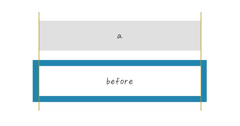
サイズの違う2つの要素を組み合わせてずらすと違和感が出てしまうので、beforeの縦横サイズwidth heightにcalc(100% - 4px)と、calcで線幅2本分(例では2px x 2px = 4px)を引いて、ボタンと枠のサイズを合わせてからずらしています。
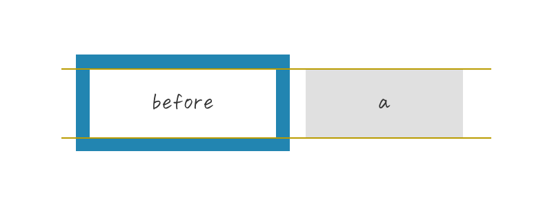
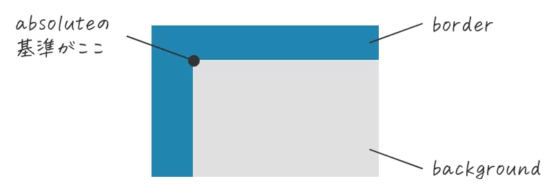
ちなみに、親要素でposition: relativeを指定してある状態でposition: absoluteを指定してtop: 0pxleft: 0pxの位置は以下画像になります。
ボタン(グレー背景色部分)にもborderを指定したいことがあるかもしれませんが、その際は配置と要素サイズには気をつけた方がいいです。
角丸のずらした枠線と背景色、矢印のボタン
<div class="button10">
  <a href="">ボタンデザイン</a>
</div>
.button10 a {
  display: flex;
  justify-content: space-between;
  align-items: center;
  position: relative;
  margin: 0 auto;
  padding: 1em 2em;
  width: 300px;
  color: #333;
  font-size: 18px;
  font-weight: 700;
  background-color: #ccc;
  border-radius: 50vh;
  transition: 0.3s;
}

.button10 a::before {
  content: '';
  position: absolute;
  top: -5px;
  left: -5px;
  width: calc(100% - 4px);
  height: calc(100% - 4px);
  border: 2px solid #3d9ec8;
  border-radius: 50vh;
  transition: 0.2s;
}

.button10 a::after {
  content: '';
  width: 5px;
  height: 5px;
  border-top: 3px solid #333333;
  border-right: 3px solid #333333;
  transform: rotate(45deg);
}

.button10 a:hover::before {
  top: 0;
  left: 0;
}

.button10 a:hover {
  text-decoration: none;
  background-color: #a0c4d3;
}
先の『ずらした枠線と背景色、矢印のボタン』の角丸タイプのボタンです。やわらかい印象になりますね。
ずらした破線の枠と背景色、矢印のボタン
<div class="button11">
  <a href="">ボタンデザイン</a>
</div>
.button11 a {
  display: flex;
  justify-content: space-between;
  align-items: center;
  position: relative;
  margin: 0 auto;
  padding: 1em 2em;
  width: 300px;
  color: #333;
  font-size: 18px;
  font-weight: 700;
  background-color: #ccc;
  transition: 0.3s;
}

.button11 a::before {
  content: '';
  position: absolute;
  top: -5px;
  left: -5px;
  width: calc(100% - 4px);
  height: calc(100% - 4px);
  border: 2px dashed #3d9ec8;
  transition: 0.2s;
}

.button11 a::after {
  content: '';
  width: 5px;
  height: 5px;
  border-top: 3px solid #333333;
  border-right: 3px solid #333333;
  transform: rotate(45deg);
}

.button11 a:hover::before {
  top: 0;
  left: 0;
}

.button11 a:hover {
  text-decoration: none;
  background-color: #a0c4d3;
}
先の『ずらした枠線と背景色、矢印のボタン』を破線にしたボタンです。若干ポップさが出ます。
少し浮いたように見えるボタン
<div class="button12">
  <a href="">ボタンデザイン</a>
</div>
.button12 a {
  display: flex;
  justify-content: space-between;
  align-items: center;
  position: relative;
  margin: 0 auto;
  padding: 1em 2em;
  width: 300px;
  color: #333;
  font-size: 18px;
  font-weight: 700;
  background-color: #cccccc;
  transition: 0.3s;
}

.button12 a::before {
  content: '';
  position: absolute;
  bottom: -7px;
  right: -7px;
  width: 100%;
  height: 2px;
  background-color: #bbbbbb;
  transition: 0.2s ease 0s;
}

.button12 a::after {
  content: '';
  position: absolute;
  top: 7px;
  right: -7px;
  width: 2px;
  height: 100%;
  background-color: #bbbbbb;
  transition: 0.2s ease 0.2s;
}

.button12 a:hover::before {
  width: 0%;
}

.button12 a:hover::after {
  height: 0%;
}

.button12 a:hover {
  text-decoration: none;
  background-color: #a0c4d3;
}
線を組み合わせたシンプルなボタン。hover時のアニメーションでも楽しめるようにしました。
背景色と明るい背景色をずらしたボタン
<div class="button13">
  <a href="">ボタンデザイン</a>
</div>
.button13 a {
  display: flex;
  justify-content: space-between;
  align-items: center;
  margin: 0 auto;
  padding: 1em 2em;
  width: 300px;
  color: #333;
  font-size: 18px;
  font-weight: 700;
  background-color: #cccccc;
  box-shadow: 5px 5px 0 #3d9ec8;
  transition: 0.3s;
}

.button13 a:hover {
  text-decoration: none;
  background-color: #a0c4d3;
  box-shadow: 0 0 0;
}明るい背景色(例では青部分)を擬似要素で表現することもできますが、ここではbox-shadowを使ってコードの短縮化を図っています。記述量がだいぶ減るのでおすすめ。ボタンだけではなく、写真やボックス要素のずらし表現にも使えるので覚えておくと便利です。
グラデーション背景色と矢印のボタン
<div class="button14">
  <a href="">ボタンデザイン</a>
</div>
.button14 a {
  display: flex;
  justify-content: space-between;
  align-items: center;
  margin: 0 auto;
  padding: 1em 2em;
  width: 300px;
  color: #333;
  font-size: 18px;
  font-weight: 700;
  background-image: linear-gradient(170deg, #659de6, #5abab8);
  border-radius: 50vh;
  transition: 0.3s;
}

.button14 a::after {
  content: '';
  width: 5px;
  height: 5px;
  border-top: 3px solid #333333;
  border-right: 3px solid #333333;
  transform: rotate(45deg);
}

.button14 a:hover {
  text-decoration: none;
  background-image: linear-gradient(-170deg, #659de6, #5abab8);
}
グラデーションボタンは色の組み合わせ次第で印象をガラっと変えられます。サイトテイストに合わせた色をチョイスする必要がありますが、ユニークな表現ができるのでおすすめです。
丸と矢印、背景色のボタン
<div class="button15">
  <a href="">ボタンデザイン</a>
</div>
.button15 a {
  display: block;
  position: relative;
  margin: 0 auto;
  padding: 1em 2em;
  width: 300px;
  color: #333;
  font-size: 18px;
  font-weight: 700;
  background-color: #cccccc;
  border-radius: 50vh;
  transition: 0.3s;
}

.button15 a::before {
  content: '';
  position: absolute;
  top: 50%;
  right: 10px;
  transform: translateY(-50%);
  width: 50px;
  height: 50px;
  background-color: #f2f2f2;
  border-radius: 50vh;
}

.button15 a::after {
  content: '';
  position: absolute;
  top: 50%;
  right: 32px;
  transform: translateY(-50%) rotate(45deg);
  width: 5px;
  height: 5px;
  border-top: 3px solid #333333;
  border-right: 3px solid #333333;
}

.button15 a:hover {
  text-decoration: none;
  background-color: #cccccc;
}
小さな丸と矢印の組み合わせはよく見かけますが、丸部分を大きくすると視認性が上がるのでおすすめ。淡い色にするのもいいですね。
背景色と線を組み合わせたボタン
<div class="button16">
  <a href="">ボタンデザイン</a>
</div>
.button16 a {
  display: block;
  position: relative;
  margin: 0 auto;
  padding: 1em 2em;
  width: 300px;
  color: #333;
  font-size: 18px;
  font-weight: 700;
  background-color: #cccccc;
  transition: 0.3s;
}

.button16 a::after {
  content: '';
  position: absolute;
  top: 50%;
  right: -35px;
  transform: translateY(-50%);
  width: 70px;
  height: 2px;
  background-color: #2285b1;
  transition: 0.3s;
}

.button16 a:hover {
  text-decoration: none;
  background-color: #bbbbbb;
}

.button16 a:hover::after {
  transform: translateX(3px);
}
シンプルなデザインのサイトに使いやすいボタンデザイン。
背景色と線、丸を組み合わせたボタン
<div class="button17">
  <a href="">ボタンデザイン</a>
</div>
.button17 a {
  display: block;
  position: relative;
  margin: 0 auto;
  padding: 1em 2em;
  width: 300px;
  color: #333;
  font-size: 18px;
  font-weight: 700;
  background-color: #cccccc;
  transition: 0.3s;
}

.button17 a::before {
  content: '';
  position: absolute;
  top: 50%;
  right: 1em;
  transform: translateY(-50%);
  width: 35px;
  height: 35px;
  border: 2px solid #2285b1;
  border-radius: 50vh;
  transition: 0.3s;
}

.button17 a::after {
  content: '';
  position: absolute;
  top: 50%;
  right: 35px;
  transform: translateY(-50%);
  width: 70px;
  height: 2px;
  background-color: #2285b1;
}

.button17 a:hover {
  text-decoration: none;
  background-color: #bbbbbb;
}

.button17 a:hover::before {
  background-color: #a0c4d3;
}
丸と線を組み合わせたボタンのデザインはよく見かけます。複数パターンがあるのでいくつかストックしておくと便利に使えると思います。
背景色と細い矢印のボタン
<div class="button18">
  <a href="">ボタンデザイン</a>
</div>
.button18 a {
  display: flex;
  justify-content: space-between;
  align-items: center;
  position: relative;
  margin: 0 auto;
  padding: 1em 2em;
  width: 300px;
  color: #333;
  font-size: 18px;
  font-weight: 700;
  background-color: #cccccc;
  transition: 0.3s;
}

.button18 a::before {
  content: '';
  position: absolute;
  top: calc(50% - 2px);
  right: 1em;
  transform: translateY(calc(-50% - 2px)) rotate(30deg);
  width: 12px;
  height: 2px;
  background-color: #2285b1;
  transition: 0.3s;
}

.button18 a::after {
  content: '';
  position: absolute;
  top: 50%;
  right: 1em;
  transform: translateY(-50%);
  width: 70px;
  height: 2px;
  background-color: #2285b1;
  transition: 0.3s;
}

.button18 a:hover {
  text-decoration: none;
  background-color: #bbbbbb;
}

.button18 a:hover::before,
.button18 a:hover::after {
  right: 0.5em;
}
細い矢印を擬似要素(beforeとafter)で表現したボタンデザイン。
背景色とずらした細い矢印のボタン
<div class="button19">
  <a href="">ボタンデザイン</a>
</div>
.button19 a {
  display: flex;
  justify-content: space-between;
  align-items: center;
  position: relative;
  margin: 0 auto;
  padding: 1em 2em;
  width: 300px;
  color: #333;
  font-size: 18px;
  font-weight: 700;
  background-color: #cccccc;
  transition: 0.3s;
}

.button19 a::before {
  content: '';
  position: absolute;
  top: calc(50% - 2px);
  right: -2em;
  transform: translateY(calc(-50% - 2px)) rotate(30deg);
  width: 12px;
  height: 2px;
  background-color: #2285b1;
  transition: 0.3s;
}

.button19 a::after {
  content: '';
  position: absolute;
  top: 50%;
  right: -2em;
  transform: translateY(-50%);
  width: 70px;
  height: 2px;
  background-color: #2285b1;
  transition: 0.3s;
}

.button19 a:hover {
  text-decoration: none;
  background-color: #bbbbbb;
}

.button19 a:hover::before,
.button19 a:hover::after {
  right: -2.5em;
}
細い矢印をボタンの外へずらしたデザイン。
2重矢印と背景色のボタン
<div class="button20">
  <a href="">ボタンデザイン</a>
</div>
.button20 a {
  display: block;
  position: relative;
  margin: 0 auto;
  padding: 1em 2em;
  width: 300px;
  color: #333;
  font-size: 18px;
  font-weight: 700;
  background-color: #cccccc;
  transition: 0.3s;
}

.button20 a::before {
  content: '';
  position: absolute;
  top: 50%;
  right: 2em;
  transform: translateY(-50%) rotate(45deg);
  width: 5px;
  height: 5px;
  border-top: 2px solid #333333;
  border-right: 2px solid #333333;
  transition: 0.3s;
}

.button20 a::after {
  content: '';
  position: absolute;
  top: 50%;
  right: calc(2em + 5px);
  transform: translateY(-50%) rotate(45deg);
  width: 5px;
  height: 5px;
  border-top: 2px solid #333333;
  border-right: 2px solid #333333;
  transition: 0.3s;
}

.button20 a:hover {
  text-decoration: none;
  background-color: #bbbbbb;
}

.button20 a:hover::before {
  right: 1.8em;
}

.button20 a:hover::after {
  right: calc(1.8em + 5px);
}
三角矢印と背景色のボタン
<div class="button21">
  <a href="">ボタンデザイン</a>
</div>
.button21 a {
  display: flex;
  justify-content: space-between;
  align-items: center;
  margin: 0 auto;
  padding: 1em 2em;
  width: 300px;
  color: #333;
  font-size: 18px;
  font-weight: 700;
  background-color: #cccccc;
  transition: 0.3s;
}

.button21 a::after {
  content: '';
  width: 0;
  height: 0;
  border-style: solid;
  border-width: 6px 0 6px 10px;
  border-color: transparent transparent transparent #333333;
  transition: 0.3s;
}

.button21 a:hover {
  text-decoration: none;
  background-color: #bbbbbb;
}

.button21 a:hover::after {
  transform: translateX(5px);
}
三角矢印と背景色のボタン2
<div class="button22">
  <a href="">ボタンデザイン</a>
</div>
.button22 a {
  display: block;
  position: relative;
  margin: 0 auto;
  padding: 1em 2em;
  width: 300px;
  color: #333;
  font-size: 18px;
  font-weight: 700;
  background-color: #cccccc;
  transition: 0.3s;
}

.button22 a::before {
  content: '';
  position: absolute;
  top: 50%;
  right: 2em;
  transform: translateY(-50%);
  width: 40px;
  height: 2px;
  background-color: #333333;
  transition: 0.3s;
}

.button22 a::after {
  content: '';
  position: absolute;
  top: 50%;
  right: calc(2em - 2px);
  transform: translateY(-50%);
  width: 0;
  height: 0;
  border-style: solid;
  border-width: 6px 0 6px 10px;
  border-color: transparent transparent transparent #333333;
  transition: 0.3s;
}

.button22 a:hover {
  text-decoration: none;
  background-color: #bbbbbb;
}

.button22 a:hover::before,
.button22 a:hover::after {
  right: 1.7em;
}
三角矢印と背景色のボタン3
<div class="button23">
  <a href="">ボタンデザイン</a>
</div>
.button23 a {
  display: block;
  position: relative;
  margin: 0 auto;
  padding: 1em 2em;
  width: 300px;
  color: #333;
  font-size: 18px;
  font-weight: 700;
  background-color: #cccccc;
  transition: 0.3s;
}

.button23 a::after {
  content: '';
  position: absolute;
  bottom: 10px;
  right: 10px;
  width: 0;
  height: 0;
  border-style: solid;
  border-width: 0 0 12px 12px;
  border-color: transparent transparent #333333 transparent;
  transition: 0.3s;
}

.button23 a:hover {
  text-decoration: none;
  background-color: #bbbbbb;
}

.button23 a:hover::after {
  bottom: 8px;
  right: 8px;
}
三角矢印と背景色の特殊な角丸ボタン
<div class="button24">
  <a href="">ボタンデザイン</a>
</div>
.button24 a {
  display: block;
  position: relative;
  margin: 0 auto;
  padding: 1em 2em;
  width: 300px;
  color: #333;
  font-size: 18px;
  font-weight: 700;
  background-color: #cccccc;
  border-radius: 30px 0 30px 30px;
  transition: 0.3s;
}

.button24 a::after {
  content: '';
  position: absolute;
  top: 10px;
  right: 10px;
  width: 0;
  height: 0;
  border-style: solid;
  border-width: 0 10px 10px 0;
  border-color: transparent #333333 transparent transparent;
  transition: 0.3s;
}

.button24 a:hover {
  text-decoration: none;
  background-color: #bbbbbb;
}

.button24 a:hover::after {
  top: 8px;
  right: 8px;
}
丸と背景色のボタン
<div class="button25">
  <a href="">ボタンデザイン</a>
</div>
.button25 a {
  display: flex;
  justify-content: space-between;
  align-items: center;
  margin: 0 auto;
  padding: 1em 2em;
  width: 300px;
  color: #333;
  font-size: 18px;
  font-weight: 700;
  background-color: #cccccc;
  transition: 0.3s;
}

.button25 a::after {
  content: '';
  width: 10px;
  height: 10px;
  background-color: #2285b1;
  border-radius: 50vh;
  transition: 0.3s;
}

.button25 a:hover {
  text-decoration: none;
  background-color: #bbbbbb;
}

.button25 a:hover::after {
  transform: scale(2);
}
大きめ丸と矢印のボタン
<div class="button26">
  <a href="">ボタンデザイン</a>
</div>
.button26 {
  text-align: center;
}

.button26 a {
  display: inline-block;
  position: relative;
  padding: 1em 110px 1em 0em;
  color: #333;
  font-size: 18px;
  font-weight: 700;
  transition: 0.3s;
}

.button26 a::before {
  content: '';
  position: absolute;
  top: 50%;
  right: 0;
  transform: translateY(-50%);
  width: 80px;
  height: 80px;
  border: 3px solid #aaaaaa;
  border-radius: 50vh;
  transition: 0.3s;
}

.button26 a::after {
  content: '';
  position: absolute;
  top: 50%;
  right: 40px;
  transform: translateY(-50%) rotate(45deg);
  width: 5px;
  height: 5px;
  border-top: 2px solid #333333;
  border-right: 2px solid #333333;
  transition: 0.3s;
}

.button26 a:hover {
  text-decoration: underline;
}

.button26 a:hover::before {
  background-color: #333;
}

.button26 a:hover::after {
  border-top: 2px solid #f2f2f2;
  border-right: 2px solid #f2f2f2;
}
小さめ丸と矢印のボタン
<div class="button27">
  <a href="">ボタンデザイン</a>
</div>
.button27 {
  text-align: center;
}

.button27 a {
  display: inline-block;
  position: relative;
  padding: 1em 1em 1em 50px;
  color: #333;
  font-size: 18px;
  font-weight: 700;
  transition: 0.3s;
}

.button27 a::before {
  content: '';
  position: absolute;
  top: 50%;
  left: 0;
  transform: translateY(-50%);
  width: 30px;
  height: 30px;
  border: 3px solid #aaaaaa;
  border-radius: 50vh;
  transition: 0.3s;
}

.button27 a::after {
  content: '';
  position: absolute;
  top: 50%;
  left: 15px;
  transform: translateY(-50%) rotate(45deg);
  width: 3px;
  height: 3px;
  border-top: 1px solid #333333;
  border-right: 1px solid #333333;
  transition: 0.3s;
}

.button27 a:hover {
  text-decoration: underline;
}

.button27 a:hover::before {
  background-color: #333;
}

.button27 a:hover::after {
  border-top: 1px solid #f2f2f2;
  border-right: 1px solid #f2f2f2;
}
2色線と矢印のボタン
<div class="button28">
  <a href="">ボタンデザイン</a>
</div>
.button28 a {
  display: block;
  position: relative;
  margin: 0 auto;
  padding: 1em 2em 1em 50px;
  width: 300px;
  color: #333;
  font-size: 18px;
  font-weight: 700;
  border-bottom: 2px solid;
  border-image: linear-gradient(90deg, #2285b1 0px, #2285b1 30px, #aaa 30px, #aaa 100%);
  border-image-slice: 1;
  transition: 0.3s;
}

.button28 a::before {
  content: '';
  position: absolute;
  bottom: 0;
  left: 0;
  width: 30px;
  height: 100%;
  background-color: #2285b1;
  transition: 0.3s;
  opacity: 0;
}

.button28 a::after {
  content: '';
  position: absolute;
  top: 50%;
  left: 10px;
  transform: translateY(-50%) rotate(45deg);
  width: 5px;
  height: 5px;
  border-top: 2px solid #2285b1;
  border-right: 2px solid #2285b1;
}

.button28 a:hover {
  text-decoration: none;
  background-color: #cccccc;
}

.button28 a:hover::before {
  opacity: 1;
}

.button28 a:hover::after {
  border-top: 2px solid #f2f2f2;
  border-right: 2px solid #f2f2f2;
}2色(青とグレー)の線はborder-imageの線形グラデーションlinear-gradientを使用して2色を表現しています。
hover時の青背景を疑似要素(before)で表現。ふわっと表示させるためにopacityで切り替え指定をしています。
左から右にアニメーションさせながら表示させたい時は、a::beforeにwidth: 0px、a:hover::beforeにwidth: 30pxと指定します(opacityは削除)。
背景色のページトップへ戻るボタン
<div class="button29">
  <a href="">ボタンデザイン</a>
</div>
.button29 a {
  display: flex;
  justify-content: center;
  align-items: center;
  margin: 0 auto;
  width: 80px;
  height: 80px;
  background-color: #cccccc;
  border-radius: 50vh;
  transition: 0.3s;
}

.button29 a::after {
  content: '';
  width: 7px;
  height: 7px;
  border-top: 3px solid #333;
  border-left: 3px solid #333;
  transform: rotate(45deg);
  transition: 0.3s;
}

.button29 span {
  width: 0px;
  height: 0px;
  visibility: hidden;
}

.button29 a:hover {
  background-color: #333333;
}

.button29 a:hover::after {
  border-top: 3px solid #f2f2f2;
  border-left: 3px solid #f2f2f2;
}
背景色と枠線のページトップへ戻るボタン
<div class="button30">
  <a href="">ボタンデザイン</a>
</div>
.button30 a {
  display: flex;
  justify-content: center;
  align-items: center;
  margin: 0 auto;
  width: 80px;
  height: 80px;
  background-color: #cccccc;
  border: 3px solid #aaaaaa;
  border-radius: 50vh;
  transition: 0.3s;
}

.button30 a::after {
  content: '';
  width: 7px;
  height: 7px;
  border-top: 3px solid #333;
  border-left: 3px solid #333;
  transform: rotate(45deg);
  transition: 0.3s;
}

.button30 span {
  width: 0px;
  height: 0px;
  visibility: hidden;
}

.button30 a:hover {
  background-color: #333333;
}

.button30 a:hover::after {
  border-top: 3px solid #f2f2f2;
  border-left: 3px solid #f2f2f2;
  transform: translateY(-5px) rotate(45deg);
}
本拙著『Webデザインアイデアレシピ』には、本記事の内容の他にも見出しデザインや画像装飾、レイアウトに使えるCSS Tipsを多数紹介しています。
出版社 マイナビ出版
単行本(ソフトカバー) 288ページ